Shutterfly · Photo books
Fewer choices, more finished photo books
New customers finished only 32% of the photo books they started. We rebuilt the creation experience around a few meaningful choices, with machine learning doing the sorting, cropping and layout.
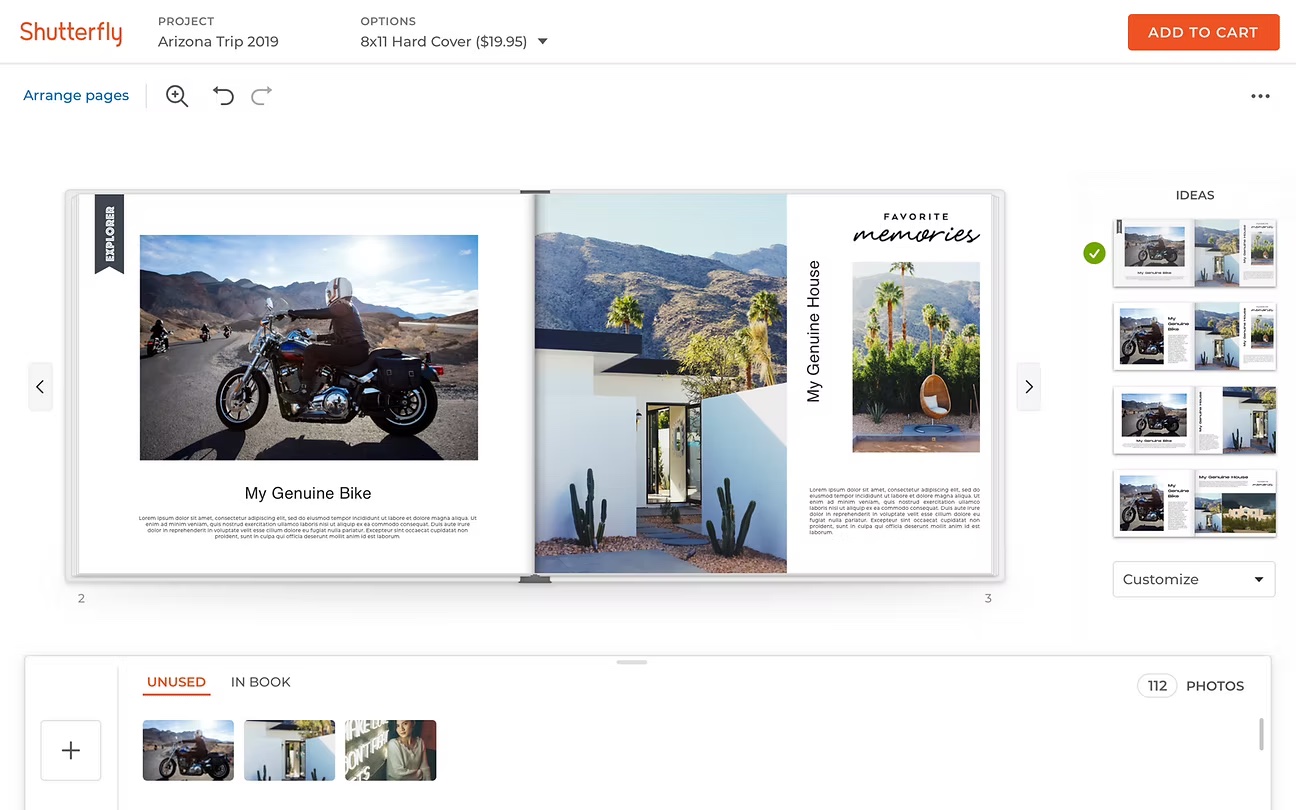
Context
Shutterfly customers make photo books in an online creation tool. It’s a big job: session data showed most people spend 3.4 hours on a book, and people told us it took them more than 9.
Overall, 63% of people who started a book finished it. For a task that long, that looked acceptable.
The problem
The 63% average hid two very different groups. Returning customers finished 84% of the books they started. New customers finished only 32%.
In interviews, new customers said the same two things again and again: it “looked too complex,” and they “just don’t have the time.” One participant put it best: “it looks like software.”
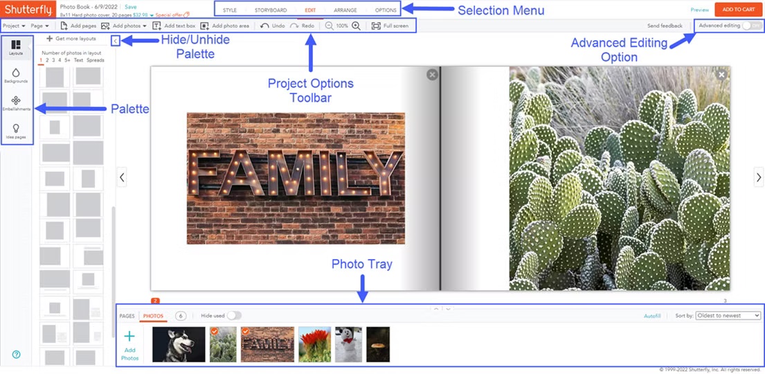
Years of added features had buried the tool’s core purpose. Returning customers had grown up with each addition; new customers met all of it at once. And with every layout, background, color, font and sticker open to change, people faced a huge number of choices at every step. A later A/B test showed those extra options did not make people happier with the finished book.
My role
I led design for the new creation experience, working with a team of designers and the engineers building the machine learning models.
- Ran new-customer interviews to find out why so many dropped off
- Defined the core idea: at any point, only a few options are worth showing
- Led concept testing with wireframes and click-through prototypes, with both new and existing customers
- Set up a four-week cycle of research sessions to test the UX and the model together
The screens shown are the work of the whole design team, whose creativity and ingenuity made this possible.
Process
The decisions that made the difference.
Show only the options that matter
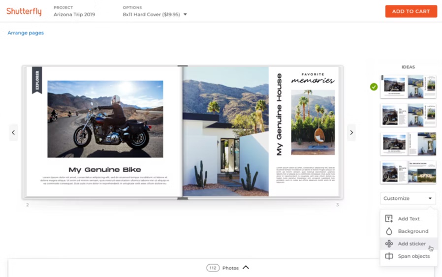
There are a hundred wrong ways to lay out a page and only a few that people like. We built the interface around that small set, so people make a few meaningful choices while still feeling fully in control of how their book looks.

Let the machine do the sorting
Nobody should have to sort and arrange their photos by hand again. Machine learning recommends layouts and handles cropping and placement. To train it, we asked customers for uncurated batches of photos, turned them into books, and fed their feedback back into the model.
Test every four weeks
Our first working prototype combined the new UX with an early model. We tested it in an in-depth session with 31 people, made changes, and repeated the test every four weeks.
Results
31
people in the first in-depth test of the working prototype
4 weeks
between each round of testing and improvement
An A/B test confirmed that removing options did not lower satisfaction with the finished book. The new experience was scheduled to launch that fall.