Pearson+ · Design system
Shipping Study Prep 40% faster, accessible to every learner
I applied and extended Pearson’s design system across the interactive flows of Study Prep, so the team could ship faster while meeting WCAG 2.2 AA accessibility standards.
Context
Pearson+ is Pearson’s study platform for millions of learners. Study Prep is its set of study tools: practice modules, video lessons and onboarding.
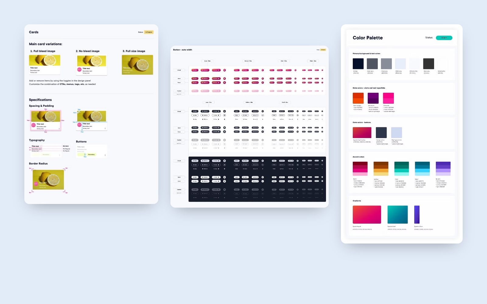
Pearson had a central design system to stop teams from rebuilding the same components and to help developers move faster. My job was to make it work for Study Prep.
The problem
Study Prep’s flows are some of the most interactive on the platform, and the hardest to keep consistent and accessible.
Practice modules, video players and onboarding layouts had to stay modern and fast, and meet strict semantic accessibility rules, without slowing down releases.
My role
I was the Lead Designer for Study Prep within a large team spanning DesignOps, engineering, product, content and marketing.
- Built reusable, responsive Figma components for study features, together with the wider design team
- Contributed to the shared atomic design system, which maps to React components in Storybook
- Worked with the accessibility task force to audit and certify key user journeys
- Kept new Study Prep features consistent with the rest of the organization’s system
Process
The decisions that made the difference.
Extend the system instead of working around it
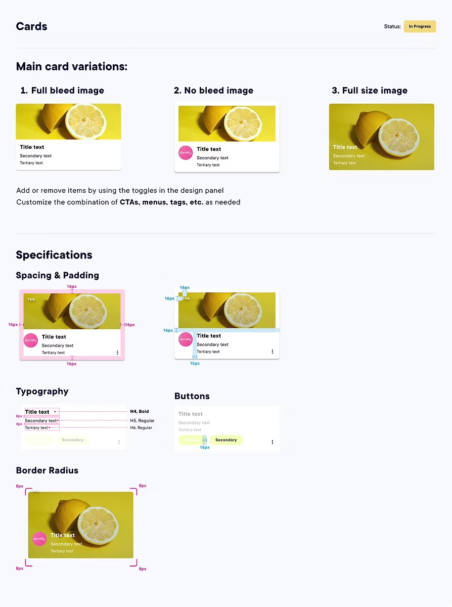
Instead of designing one-off screens, we built Study Prep components as part of the shared atomic system. Each one maps to a React component in Storybook, so design and code stay in sync.
Build accessibility into each component
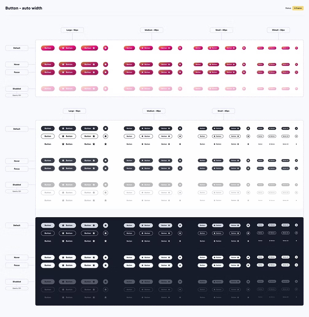
Interactive states, video controls and screen-reader layouts were designed to meet WCAG 2.2 AA from the start, so every feature built from them inherits it.
Align before building
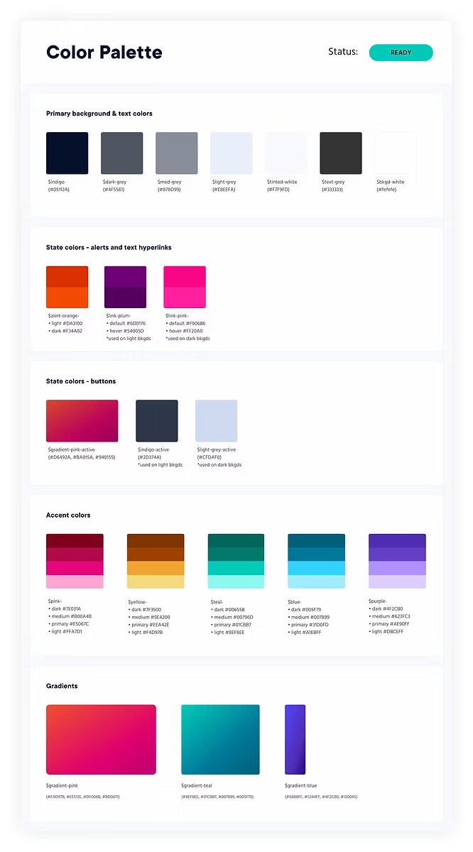
I worked with content, marketing and engineering stakeholders early, so new features looked and behaved like the rest of Pearson+.
Results
40%
faster delivery for Study Prep, by cutting duplicated layout work
30%
faster design team, thanks to shared navigation patterns and UX foundations
2.2 AA
WCAG compliance for key Study Prep journeys