Shutterfly · Mobile app
An app behind nearly half of Shutterfly’s new customers
I led the redesign of Shutterfly’s native app and the team behind it, rebuilding navigation and the core purchase flows for mobile.
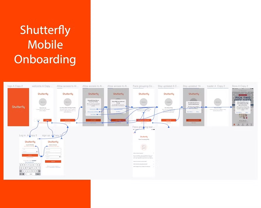
Context
Shutterfly’s mobile app lets millions of active users design and buy personalized photo products.
The goal of the redesign was to modernize shopping, keep customers coming back, and improve the end-to-end purchase flow to grow mobile sales.
The problem
The app had grown into a complex design-and-create tool that was hard to use on a phone.
The team was spread across three offices, with many stakeholders and tough technical constraints. Getting to one coherent app meant bringing all of them together.
My role
As Design Manager, I led the redesign and the team doing it.
- Managed and mentored 5 web and mobile designers across three offices
- Led the strategy for a new navigation structure and core user flows
- Set up fast prototyping workflows and continuous usability testing
- Brought stakeholder input together into one direction for the app
Process
The decisions that made the difference.

Rebuild the navigation from the ground up
We rethought the app’s information architecture, then tested and iterated on it, to turn a complex creation tool into an app built for the phone first.
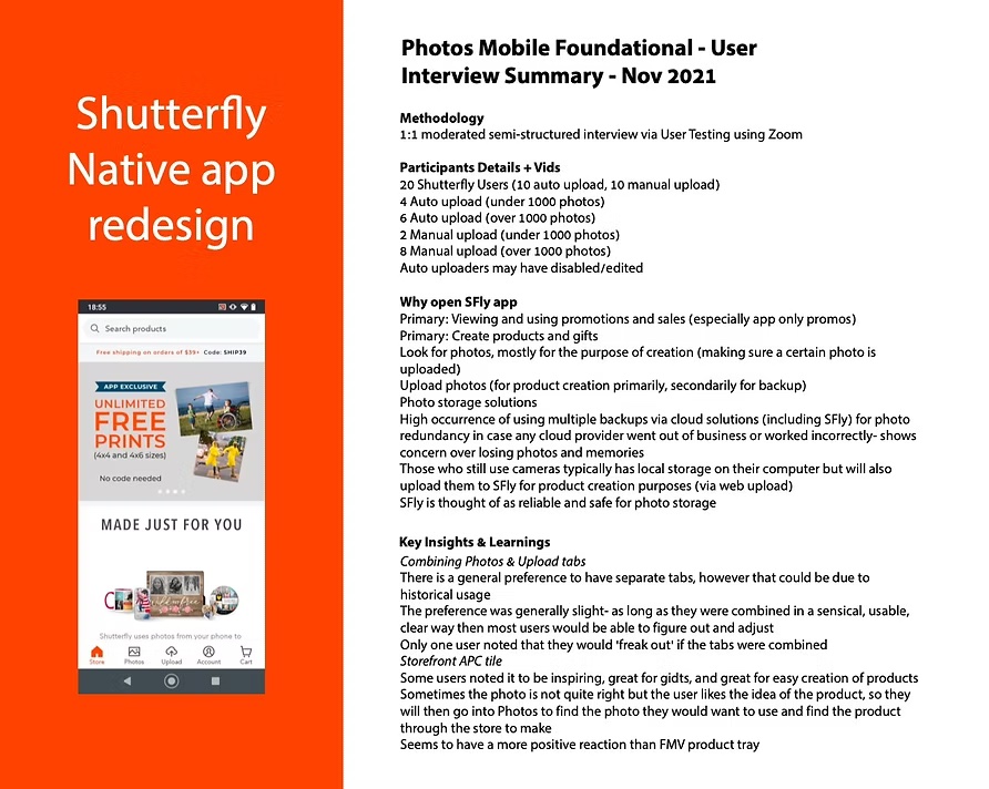
Prototype fast, test continuously
The team checked concepts in regular usability tests and research before handing them to engineering, which made handoff smoother.
Grow the team with the product
I matched each designer’s growth goals to product needs, and built a shared, data-informed design culture across all three offices.
Results
~50%
of Shutterfly’s new customers came through the app
4.5★
rating on the Apple App Store after release
+4.5%
checkout conversion across mobile and web
−12%
cart abandonment
The redesigned app became one of the company’s main growth engines. Fixing friction in the purchase funnel brought in millions of dollars in incremental revenue, and new DesignOps standards cut design-related front-end bugs by 40%.